AI-generated design
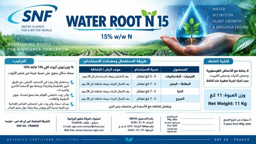
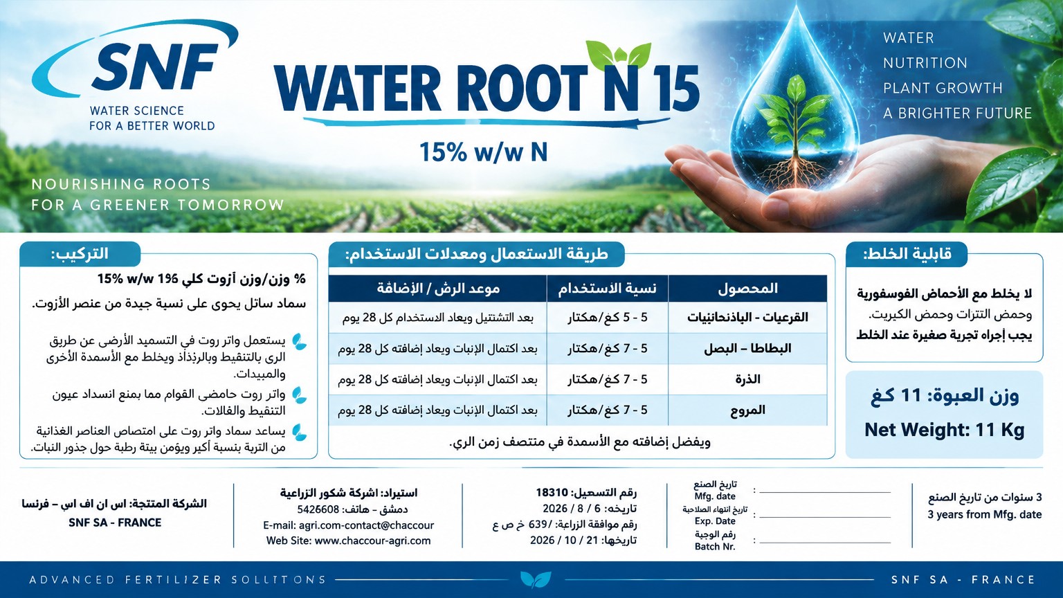
Create an exceptionally professional, premium agricultural fertilizer label for the product WATER ROOT N 15, manufactured by SNF SA, France. ## 1. EXACT LABEL FORMAT — MANDATORY The label MUST be designed in A5 LANDSCAPE (horizontal) orientation. - Exact physical dimensions: 21 cm wide × 14.8 cm high. - Aspect ratio: approximately 1.42:1. - Orientation: horizontal, landscape, NOT vertical or portrait. - Composition: wide horizontal rectangular label. - Design the complete front-facing label artwork to fit these exact proportions. - Prepare a high-resolution, print-oriented composition at 300 DPI, equivalent to approximately 2480 × 1748 pixels. - Keep all important text, logos, and graphic elements within safe margins. - Do not crop, stretch, or distort any content to fit the format. The entire design must be composed specifically for this horizontal A5 format. Do not create a vertical label and do not simply rotate a portrait design. ## 2. ART DIRECTION AND VISUAL IDENTITY Create a premium, modern, sophisticated label inspired by agricultural innovation, water management, root nutrition, and advanced fertilizer technology. Use the attached reference image of a human hand holding a luminous technological water droplet as inspiration for the background. Place a beautiful, realistic photographic composition featuring a hand supporting a glowing, translucent blue water droplet with subtle technological circuit patterns across the UPPER PORTION of the horizontal label. The background must communicate scientific innovation, efficient water use, and agricultural expertise. Use a soft-focus photographic effect with subtle turquoise, cyan, and pale-blue tones. Keep the background slightly blurred and discreet so that it never interferes with text readability. Blend the image naturally into a clean white information area. Use a refined corporate color palette: - Deep navy blue. - Turquoise. - Cyan blue. - White. - Subtle silver-gray accents. Add a thin, elegant horizontal blue line beneath the product title. This line must extend across a substantial portion of the label and clearly separate the product identity from the technical information. Use precise alignment, balanced spacing, subtle scientific graphic details, and an elegant editorial grid. ## 3. BRANDING AND PRODUCT NAME Use the authentic supplied SNF logo. Do not invent or redesign the logo. Display the following text exactly: WATER ROOT N 15 15% w/w N The product name must be the main visual focal point, with bold, modern, premium typography. Arrange the logo and product title prominently in the upper section without overcrowding the composition. ## 4. HORIZONTAL LAYOUT STRUCTURE Because the label is A5 LANDSCAPE, organize the content into THREE main horizontal zones: ZONE A — UPPER HEADER: - SNF logo. - Product name: WATER ROOT N 15. - Composition: 15% w/w N. - Technological water-droplet background. - Elegant horizontal blue separator. ZONE B — MAIN INFORMATION: Organize the Arabic product description, benefits, directions for use, and mixing compatibility into compact, clearly separated panels. Use the horizontal width efficiently. Place related information blocks side by side where appropriate, while maintaining the correct right-to-left direction of Arabic text. ZONE C — LOWER FOOTER: Include the product weight, manufacturer, importer, contact information, website, regulatory details, manufacturing date, expiry date, batch number, and shelf-life information. Use a compact but highly readable footer. Do not sacrifice legibility simply to fit more information. ## 5. COMPOSITION AND PRODUCT DESCRIPTION Display the following text exactly: التركيب: 15 % وزن/وزن آزوت كلي 15% w/w N سماد سائل يحوي على نسبة جيدة من عنصر الآزوت. Display the following product descriptions exactly: يستعمل واتر روت في التسميد الأرضي عن طريق الري بالتنقيط وبالرذاذ ويخلط مع الأسمدة الأخرى والمبيدات. واتر روت حامضي القوام مما يمنع انسداد عيون التنقيط والفالات. يساعد سماد واتر روت على امتصاص العناصر الغذائية من التربة بنسبة أكبر ويؤمن بيئة رطبة حول جذور النبات. Use professional Arabic typography, correct right-to-left alignment, comfortable line spacing, and subtle blue headings. ## 6. DIRECTIONS FOR USE — ARABIC TABLE Create a clean, professional table that fits the horizontal A5 layout. Use these column headings exactly: المحصول نسبة الاستخدام موعد الرش / الإضافة Include the following rows exactly: ROW 1: القرعيات - الباذنجانيات 5 - 7 كغ/هكتار بعد التشتيل ويعاد الاستخدام كل 28 يوم ROW 2: البطاطا – البصل 5 - 7 كغ/هكتار بعد اكتمال الإنبات ويعاد إضافته كل 28 يوم ROW 3: الذرة 5 - 7 كغ/هكتار بعد اكتمال الإنبات ويعاد إضافته كل 28 يوم ROW 4: المروج 5 - 7 كغ/هكتار بعد اكتمال الإنبات ويعاد إضافته كل 28 يوم Below the table, display this sentence exactly: ويفضل إضافته مع الأسمدة في منتصف زمن الري. TABLE DESIGN: Use a white background, thin navy-blue grid lines, alternating pale-blue row backgrounds, clear column headings, and excellent text alignment. Ensure that the Arabic text reads naturally from right to left and that each entry stays inside its correct cell. ## 7. MIXING COMPATIBILITY Display this text exactly: قابلية الخلط: لا يخلط مع الأحماض الفوسفورية وحمض النترات وحمض الكبريت. يجب إجراء تجربة صغيرة عند الخلط. Place this information inside a discreet, clearly readable panel with a fine blue border. ## 8. PRODUCT WEIGHT Display the following exactly: وزن العبوة: 11 كغ Net Weight: 11 Kg ## 9. MANUFACTURER AND DISTRIBUTOR Display all the following information exactly: الشركة المنتجة: اس ان اف اس اي – فرنسا SNF SA - FRANCE استيراد: شركة شكور الزراعية دمشق – هاتف: 5426608 E-mail: agri.com-contact@chaccour Web Site: www.chaccour-agri.com Use a clean, compact footer with consistent alignment and professional typography. ## 10. REGULATORY INFORMATION Display the following information exactly: رقم التسجيل: 18310 تاريخه: 6 / 8 / 2026 رقم موافقة الزراعة: 639 / خ ص ع تاريخها: 21 / 10 / 2026 ## 11. MANUFACTURING, EXPIRY, BATCH, AND SHELF LIFE Include these bilingual fields exactly: تاريخ الصنع Mfg. date تاريخ انتهاء الصلاحية Exp. Date رقم الوجبة Batch Nr. Leave sufficient blank space next to each field for the information to be added later. Display the following shelf-life information exactly: 3 سنوات من تاريخ الصنع 3 years from Mfg. date ## 12. TYPOGRAPHY AND READABILITY Use a modern, professional Arabic typeface that supports correct Arabic letter connections and right-to-left layout. Use consistent font sizes, clear headings, high contrast, and a disciplined grid. The label must remain readable at its actual physical size of 21 × 14.8 cm. Prioritize legibility over decoration. Avoid excessively small text, cramped paragraphs, unnecessary icons, and decorative elements that interfere with technical information. ## 13. CRITICAL TEXT ACCURACY Preserve every supplied Arabic and English word, number, unit, date, company name, contact detail, website address, registration number, and approval number exactly as provided. Do not translate, paraphrase, abbreviate, or invent any information. Do not omit any supplied text. Do not add unverified technical claims, certifications, or regulatory details. If the image-generation model cannot reproduce Arabic accurately, preserve the complete visual design and provide clean, correctly sized areas for inserting the original text later. ## 14. FINAL OUTPUT Produce ONE complete, flat, front-facing agricultural fertilizer label. Mandatory final specifications: - A5 landscape orientation. - Exact proportions: 21 cm wide × 14.8 cm high. - Horizontal rectangular artwork. - High-resolution, print-oriented design. - Approximately 2480 × 1748 pixels at 300 DPI. - Premium navy-blue, turquoise, and white visual identity. - Technological water-droplet photographic background in the upper portion. - Authentic SNF logo. - Prominent WATER ROOT N 15 product name. - Thin horizontal blue separator. - Clearly organized Arabic technical information and table. - All commercial and regulatory details included. - No bottle mockup. - No perspective view. - No portrait composition. - No distorted text or decorative clutter. The final design must look like a premium agricultural product label created by an experienced international packaging design agency, specifically optimized for the A5 horizontal format.
October 26, 2026
More fertilizer label designs