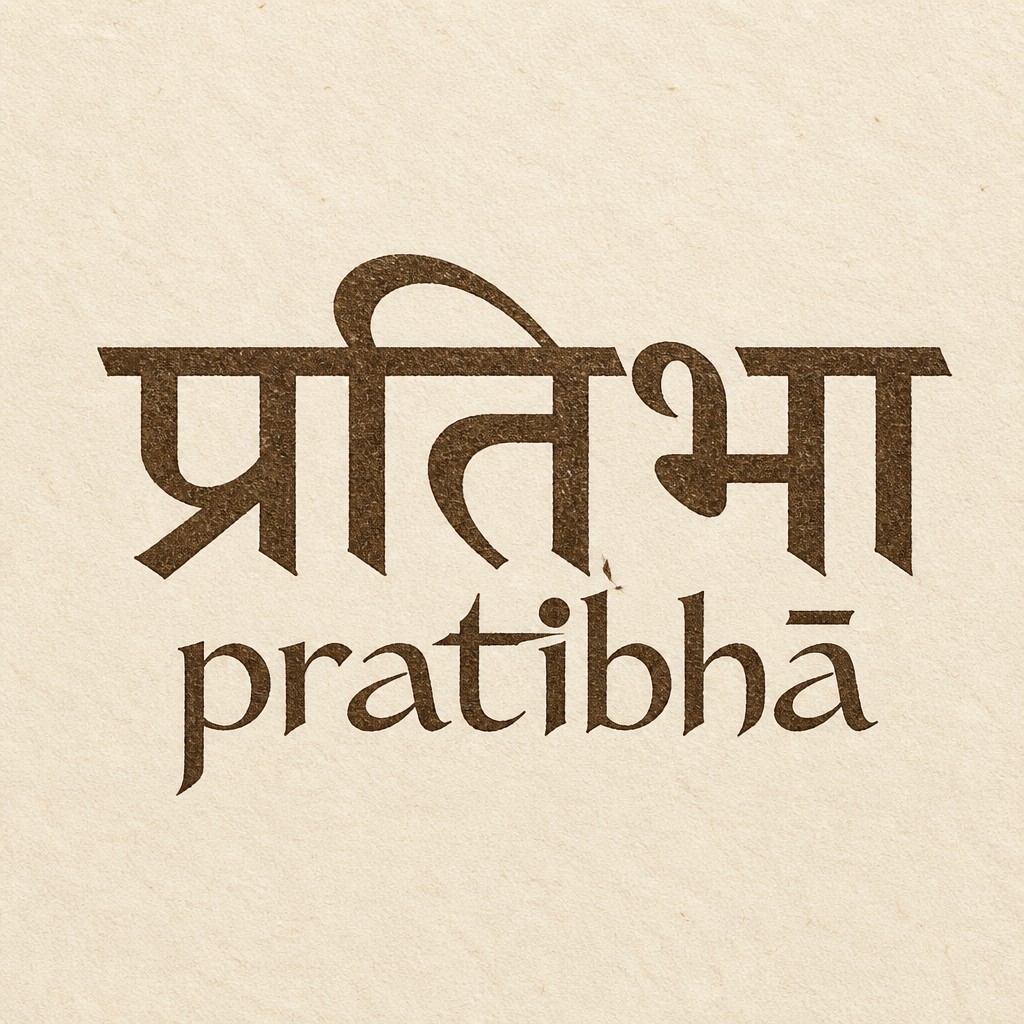
AI-generated design
Same bilingual lockup. Do not change the Devanagari. Top line, locked: प्रतिभा Exact classical spelling. Continuous unbroken shirorekha. Do not restyle, redraw, ornament, or Latinize the Devanagari. It stays the larger, primary line. Bottom line only — redesign as a custom Latin logotype, not a book font: pratibhā Exact letters: p r a t i b h ā Keep the macron on the final ā. All lowercase. The Latin must feel powerful, beautiful, and unique — a drawn wordmark, not Times, Garamond, Didot, or Playfair. Low-to-medium contrast. Slightly condensed. Tight, even spacing. Stroke like a sharp quill: firm verticals, finer joins, no hairline fashion serifs. Custom letter moments (keep them quiet, not decorative): - the t crossbar is a single sharp horizontal, a little longer than normal, like a flash of insight - the i-dot is a small solid bindu disc, not a square tittle - the a is open and wide, oldstyle, not a two-story newspaper a - b and h share the same arch rhythm, so “bh” reads as one sound - the ā macron is a short, thick, confident bar, optically centered Hierarchy: Devanagari is the voice. Latin is the signature under it — smaller, darker, more intense. Same walnut-ink / letterpress impression on cream rag paper as the current piece. No gold, no black luxury field, no extra words, no tagline, no yantra, no lotus, no rules, no boxes.
September 1, 2026
More logo designs